Tanium
UX/UI DESIGN
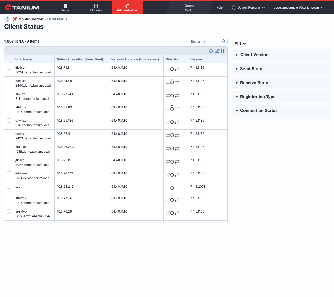
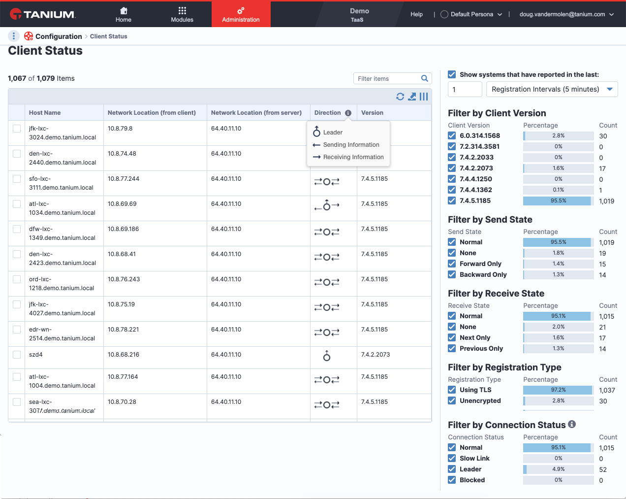
I was tasked with helping Tanium clean up actions on their Client Status portal. How to make the direction icons more clear, how to make it clear when a network location has an issue, and how to make filtering more efficient and clear.
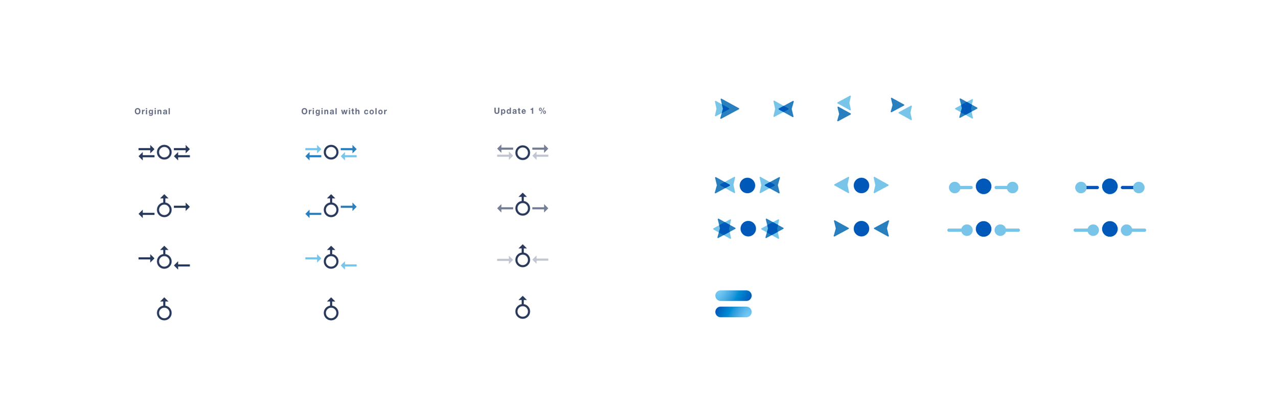
DIRECTION ICONS
Previously Tanium users had no way to understand what the direction icons represented without contacting an account manager to refresh them from their onboarding. I recommended simple tool tips when hovering over a particular direction or by an information icon in the header. Being new to the product and not having any data on how a normal user would interact with this column on a regular basis, both ideas could be tested with users to see which one is less obtrusive and most helpful.
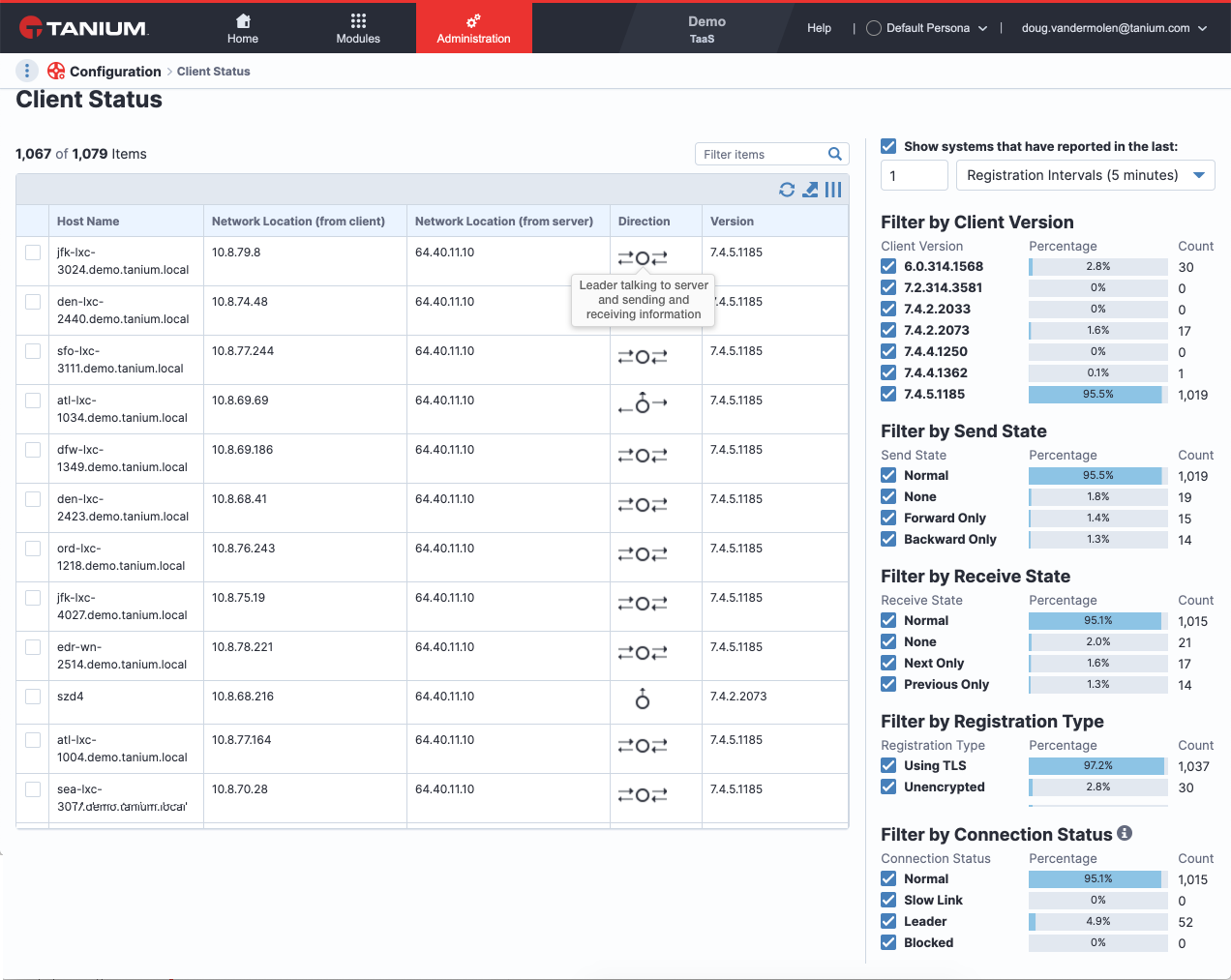
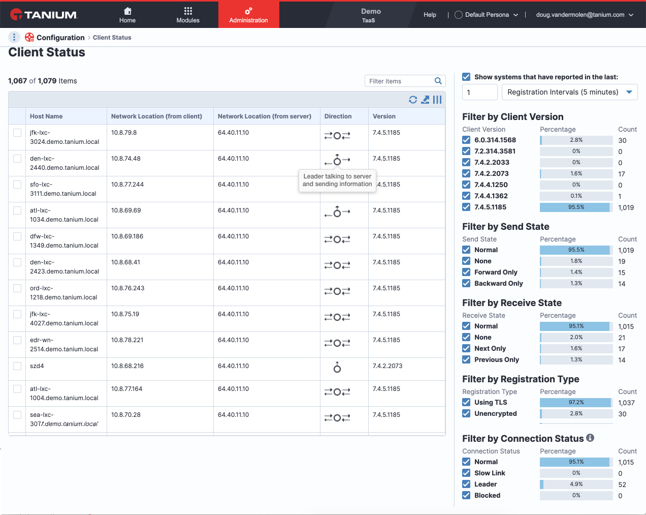
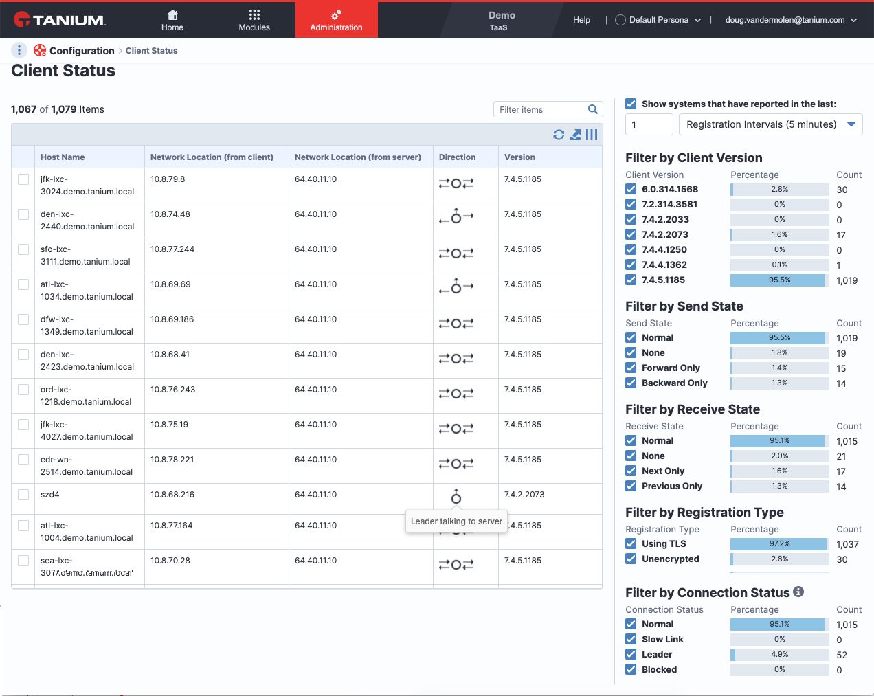
Direction Icon Exploration
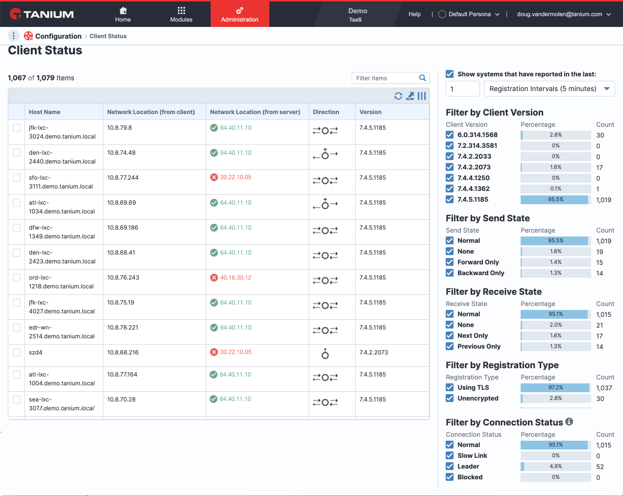
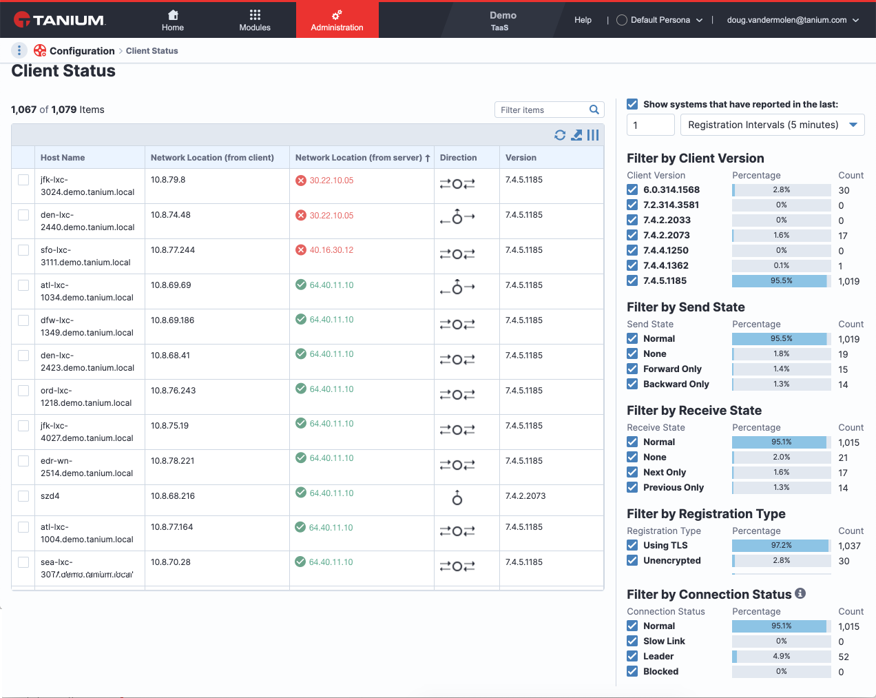
NETWORK LOCATION
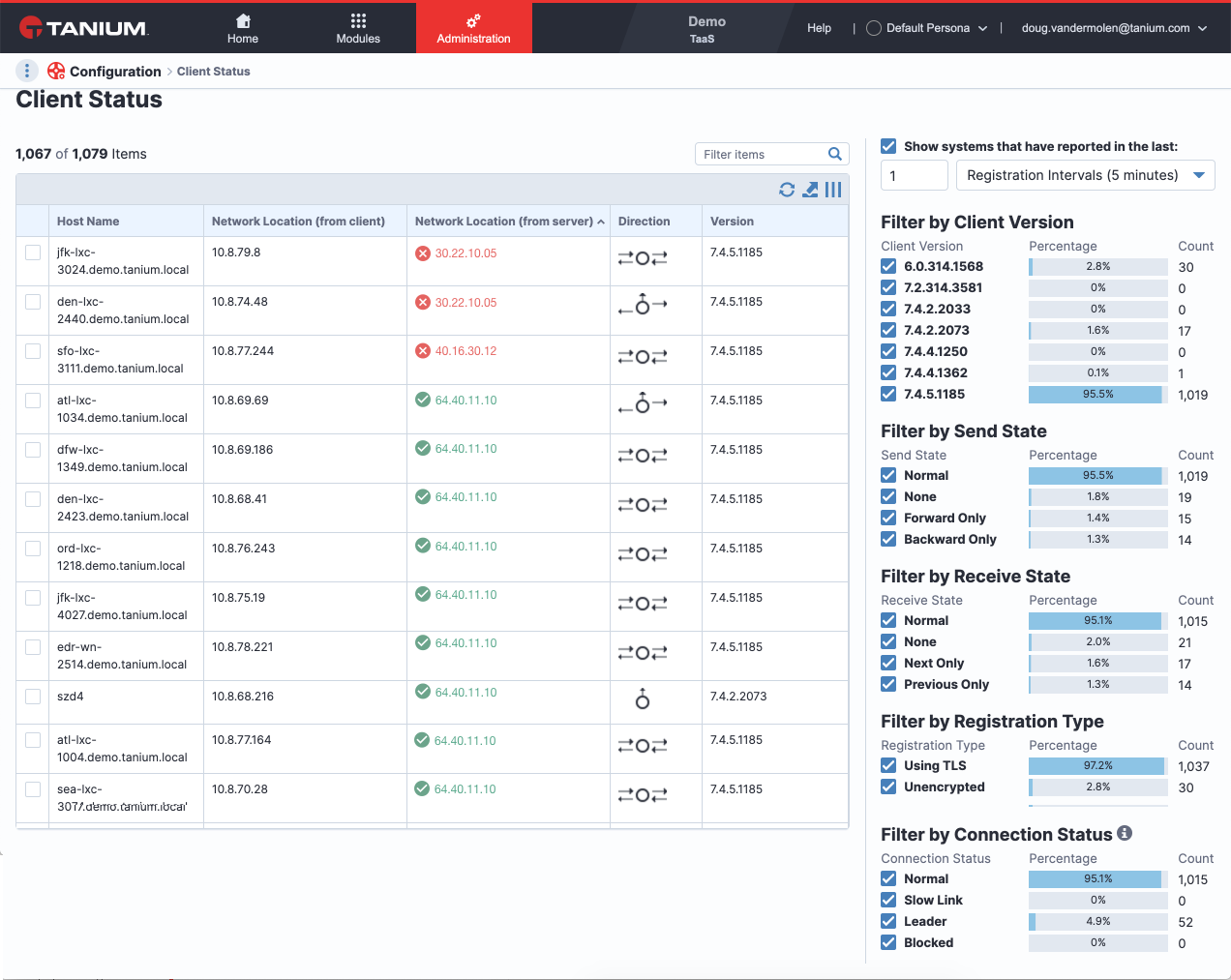
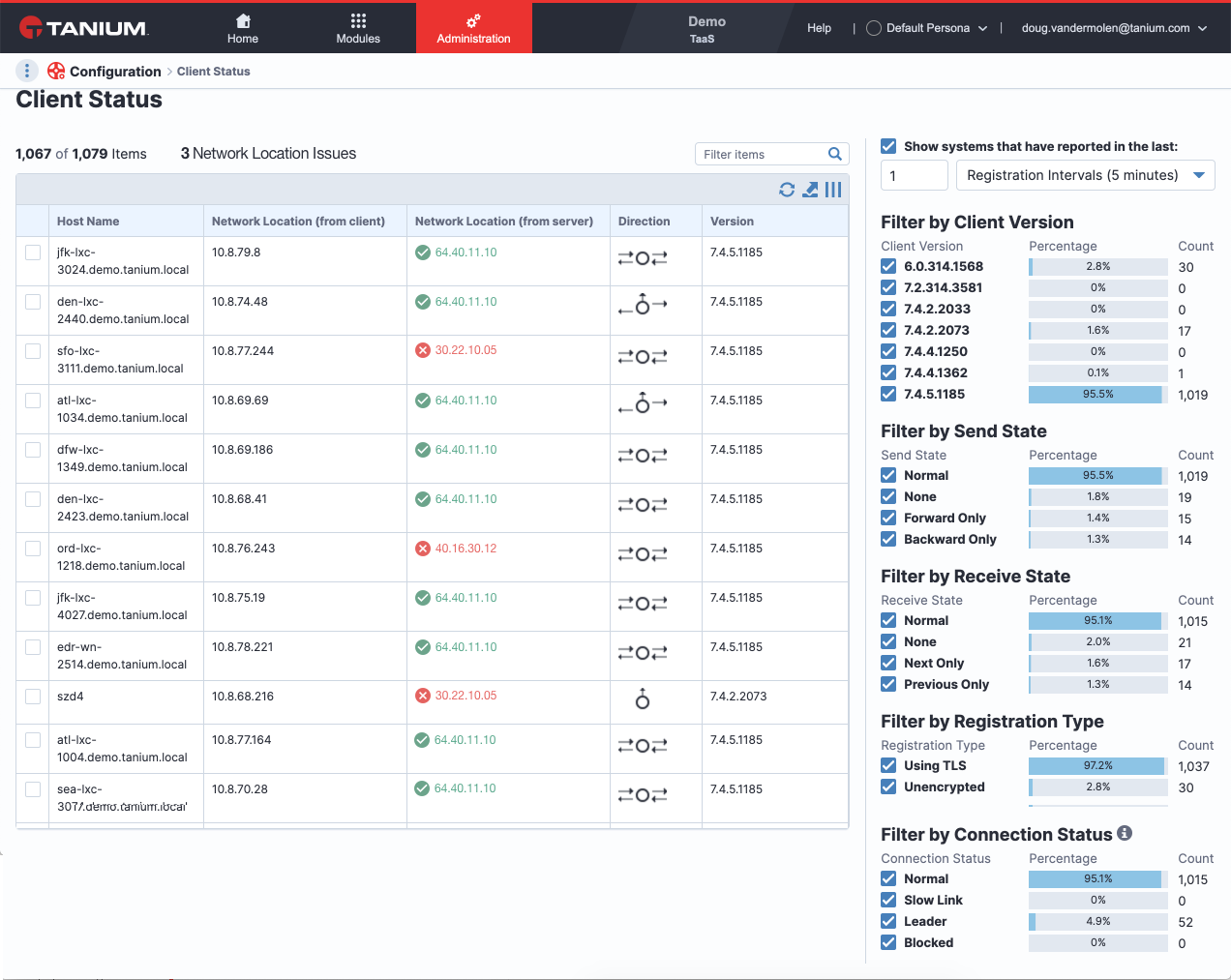
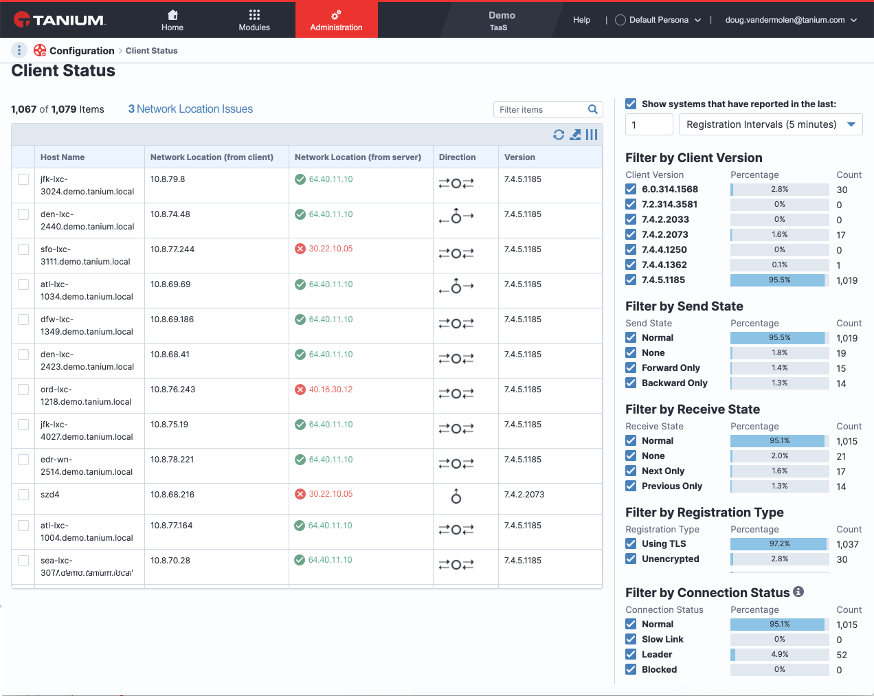
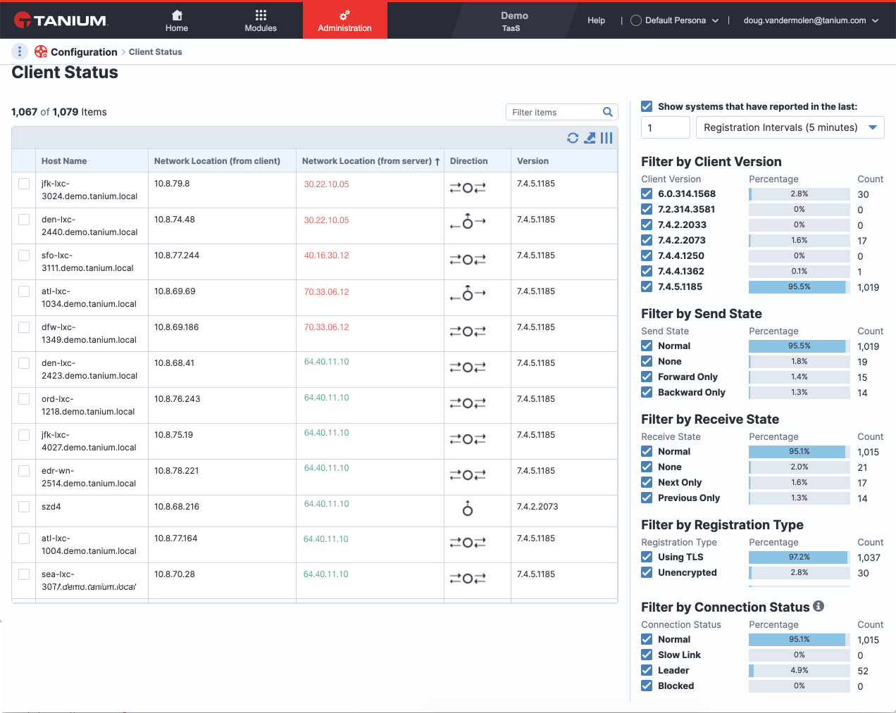
Previously Tanium users saw the network location in the exact same charcoal text as everything else in the table. I provided multiple examples of how the Network Location could appear to quickly alert the user of an issue. I also provided options for reordering the networks in the event that a user wanted to see all alerts together to better assess the issue. Not having accurate data on the pain points and use case of this scenario, I provided an example of alerting the user of the number of issues at the top of the table, going off the assumption that if issues are of major importance, why ask the user to go through the table at all? What would happen if the user could immediately jump into the issues with only one click?
FILTERING
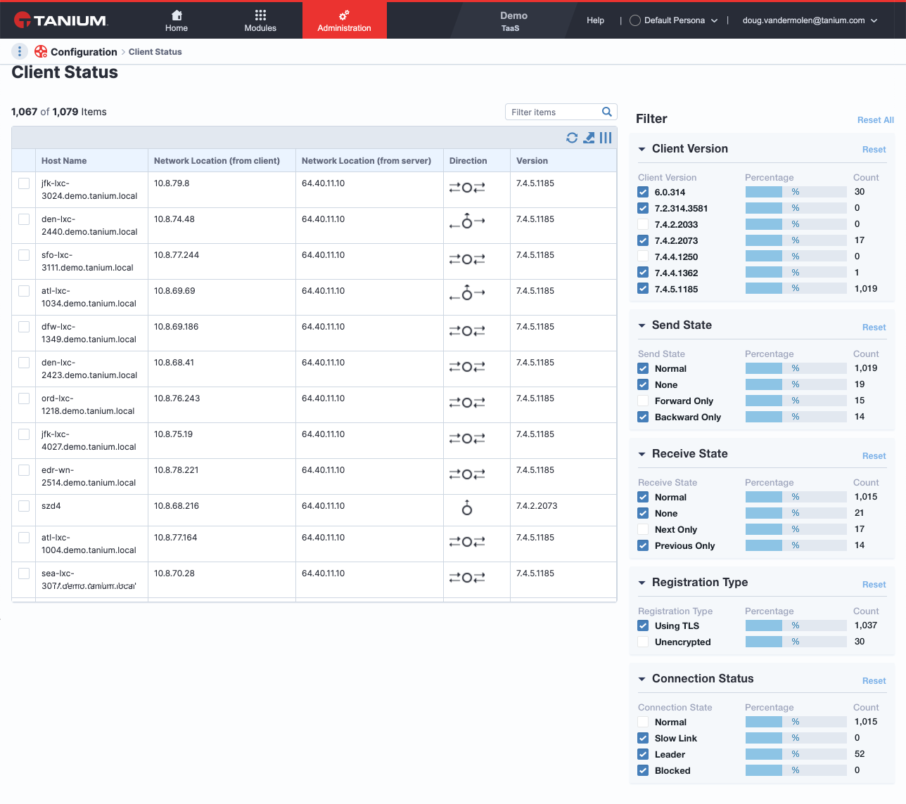
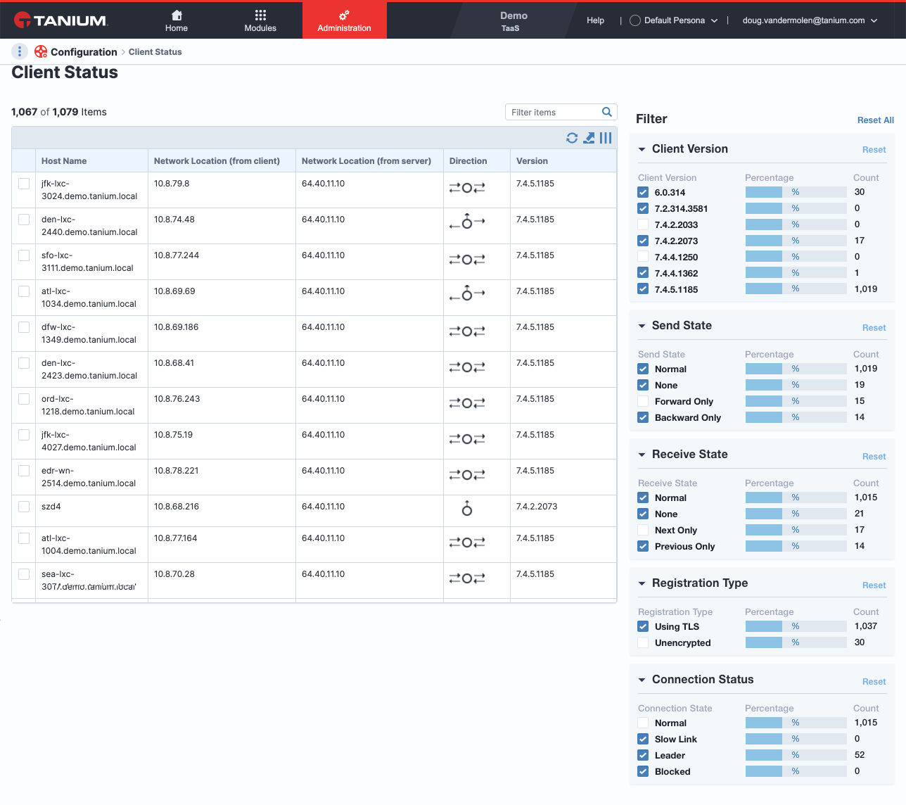
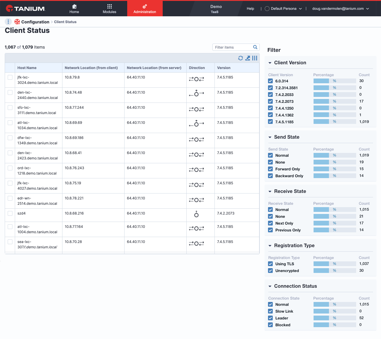
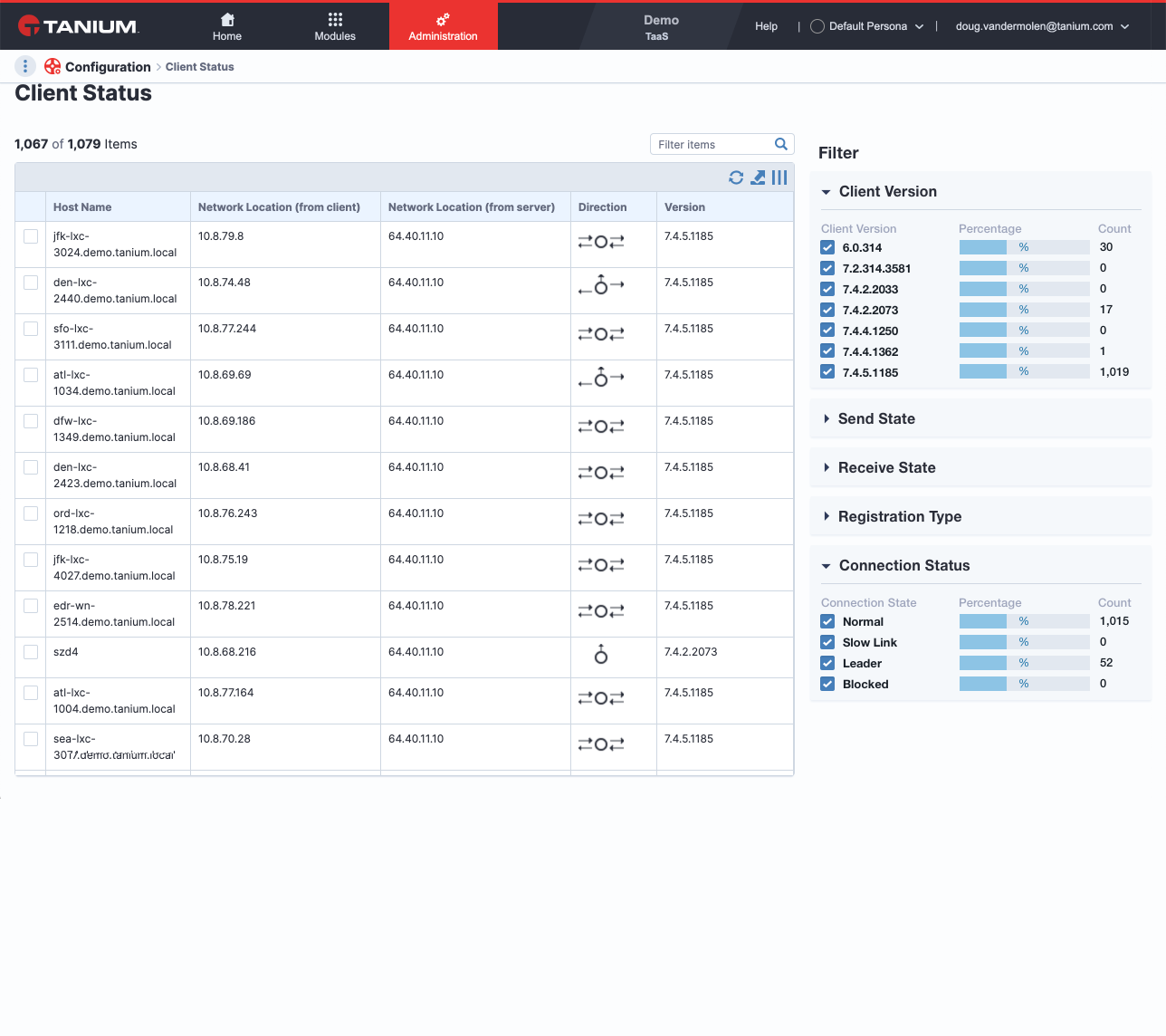
Previously Tanium users had an unenjoyable experience filtering client statuses (see filtering in above screens). I was provided data that showed how varying the use cases on filtering were. Some users only needed one section for filtering, others needed a range but never all the options at once. The main complaint was having to see all options all the time and having their experience feel overwhelming when trying to do something as simple as filtering. I created a solution that allowed the user to expand or collapse their area of interest and reset only one section or all filters at once. I feel as though filtering could be more simplified with a better understanding of the users needs but iterating in this direction begins the process.